Posted on Leave a comment

Lockdown Papercutting Project Day 49: Deco Rose Woman

papercut 659 deco rose woman - horizontal - LaserSister - KayVincent

Deco Rose Woman #659

“Deco Rose Woman” is from an ongoing papercutting project that I’ve been doing. (Basically I’m trying to work my way through all of the designs in the “922 Decorative Vector Ornaments” book by Dover Books.) Today’s design is number 659 in the book:

Closer up:

For once it should be fairly obvious how I’ve chosen the title for this design. It’s a woman with an Art Deco style rose in her hair. Easy!

And since there’s already a face deliberately included in the design, my eyes aren’t trying to trick me into seeing other little faces in the design (like they were in yesterday’s design and also this one).

I loved cutting this one, but especially adapting it. Faces are often really hard to adapt into realistic-looking papercutting designs. After all, how do you link people’s eyes, noses and mouths etc., without making the linking-pieces seem really ‘forced’? But in this case the design was very forgiving, because the nostril just hooks onto the rest of the nose, and the eyebrow and eye extend fairly naturally into the hair.

The expression on her face is a bit dour, so I’m not sure what I could use this particular design for. But if I adapted the expression a bit then it might work in a general illustration that required a woman’s face in it.


Today while creating this post I’ve been having a bit of a 1980s flashback, by listening to some of John Denver’s greatest hits.


Any comments on today’s post or design? You can chip in via the comments page, or Facebook, Twitter, LinkedIn or Instagram.

Posted on Leave a comment

Lockdown Papercutting Project Day 48: Roses and Ribbons

Roses and Ribbons #689

“Roses and Ribbons” design is part of my ongoing papercutting challenge. (I’m trying to work my way through all of the designs in the “922 Decorative Vector Ornaments” book by Dover Books.)

Today’s design is number 689 in the book. For once I haven’t had to scratch my head too much thinking of a title/description for the design. It’s just got roses and ribbons in it (and leaves, I suppose). I don’t think any of the other motifs have had just those elements, so hooray – I’ve got a unique title for the piece.

Closer up:

Oh dear. That weird thing has happened again, where my eyes have spotted faces in the design that aren’t supposed to be there, and now I can’t un-see them. Where the two bits of ribbon meet in the middle at the top, I can see two faces touching each other. They look like those Greek tragedy masks, with the exaggerated lips and eyebrows:

…and so what started out as a perfectly lovely design of ribbons and roses has now become two Greek tragedy masks just on the verge of having a passionate kiss. Eeew.

Anyway, until I started to see it that way I had particularly liked this design. And I certainly enjoyed cutting it. I think I can see myself using it in another project in future, but I will definitely have to do something about those two kissing masks, first!

Any comments? (e.g. is it really just me who sees those masks?!) You can chip in via the comments page, or Facebook, Twitter, LinkedIn or Instagram.

Posted on Leave a comment

Lockdown Papercutting Project Day 47: Spiky Flower

Spiky Flower #691

“Spiky Flower” is from an ongoing papercutting project that I’ve been doing. (Basically I’m trying to work my way through all of the designs in the “922 Decorative Vector Ornaments” book by Dover Books.)

Today’s design is number 691 in the book. As always I’ve had to come up with a name for it myself (because in the book the motifs just have numbers and not names), but as so many of the designs involve flowers, I couldn’t just call it “Flower” because that wouldn’t differentiate it from all of the other flowers. This particular flower has got jagged, spiky lines in it. Hence the name.

Closer up:

I especially enjoyed cutting the extremely thin middle section of the flower – that was a real challenge. Looking at it again now, I’m not even sure how I managed it!

Although I like the overall look of this motif, a couple of elements don’t really seem to match the rest of it. It’s those very thin lines that don’t fit (according to my eyes, anyway). On the other hand, if the lines were made thicker then they would mess up the look of the design and make it hard to tell what they were. As the moment it’s obvious that they are the edges of leaves, but if they were thicker then they might look like side shoots or something.

So I almost definitely won’t be using this design again ‘as is’.

Never mind though – it wasn’t a wasted exercise. I’ve gained more experience in cutting, and I’ve got another design to put in my papercutting sketchbook.

On a completely different note: Oh goody. Look what Rob’s brought home from the supermarket because they had a ‘reduced’ sticker on them:

Now I get to hoik their guts out and descale them. Yay. Oh well, at least the meal should hopefully be better than last week’s effort.

Any comments? You can chip in via the comments page, or Facebook, Twitter, LinkedIn or Instagram.

Posted on Leave a comment

Lockdown Papercutting Project Day 46: Tri-Leaf Trio

Tri-Leaf Trio #707

This “Tri-Leaf Trio” is from the ongoing papercutting project that I’ve been working on for ages. (I’m trying to work my way through all of the designs in the “922 Decorative Vector Ornaments” book by Dover Books.)

Today’s design is number 707 in the book. It’s a bit of a tonguetwister – a trio of three leaves:

Closer up:

I enjoyed cutting this one. Thin tendrils combined in filigree-type elements. It makes for a delicate-looking design that looks a bit more complicated than it actually is.

When I first cut it I really liked it. But then I encountered a problem. The problem is that with a lot of floral or leafy designs, quite often my eyes spot little faces in the pattern that aren’t supposed to be there. In this case, the ivy-leaf designs look like Venetian carnival masks. The kind that just cover your eyes and nose. To me they always look a bit creepy – but the ones in this design look especially mean, with their slitty eyes and cruel leafy beaks.

Is it just me, or does anyone else see creepy faces in wallpaper designs etc?!

Any comments? You can chip in via the comments page, or Facebook, Twitter, LinkedIn or Instagram.

Posted on Leave a comment

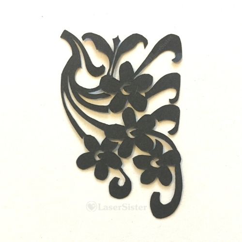
Lockdown Papercutting Project Day 45: Art Nouveau Corner Swag

Art Nouveau Corner Swag #720

“Art Nouveau Corner Swag” is from the ongoing papercutting challenge that I’ve been continuing during the 2020 Lockdown(s). Basically I’m trying to work my way through all of the designs in the “922 Decorative Vector Ornaments” book by Dover Books.

Today’s design is number 720 in the book. As always I had to come up with my own name/description for this design, but I didn’t know what the flowers were. (Are they forget-me-nots??) So “Art Nouveau Corner Swag” is what I ended up with:

Closer up:

It’s a fairly simple design, but that’s one of the reasons I like it. It also had some very satisfying curves to cut, as well. I can see this design on a birthday card, or as part of a backdrop for another more complex project. This one is obviously for the top right corner of a design, so the image can be flipped to create the corresponding top left corner of the design, and that will nicely frame a message or another motif.

As usual I’m particularly drawn to this one anyway because it’s got the Art Nouveau-type curves and swirls in it.

Any comments? You can chip in via the comments page, or Facebook, Twitter, LinkedIn or Instagram.

Posted on Leave a comment

Lockdown Papercutting Project Day 42: Knotwork Railing

Knotwork Railing #706

This “Knotwork Railing” design is from the ongoing papercutting challenge that I’ve been doing. (Basically I’m trying to work my way through all of the designs in the “922 Decorative Vector Ornaments” book by Dover Books.)

Today’s design is number 706 in the book. What the heck would you call that style of design? In the end I decided that it reminded me of a cross between Celtic knotwork and lovely iron gates and railings. So that’s how I ended up with the title “Knotwork Railing”:

Closer up:

I’m really pleased with the way this one turned out. For a start I love the design anyway, but I also managed to cut it so that the lines were quite thin and even, and so that it was pretty symmetrical. And yet (to me, anyway) it still looks hand-cut and not like a machine has just cranked it out.

It’s another design that would probably look really good in a fancy wedding invitation or congratulations card. And the bonus is that it doesn’t take a very long time to cut. Yet another reason to love this design.

The reason I love this design is that it combines three of my favourite things. Celtic knotwork, and fancy ironwork. Years ago I got a book out of the library on how to draw Celtic knotwork, and I loved it so much that I then went and bought it.

And whenever I’m out anywhere my attention is always caught by swirly ironwork designs wherever I am. In the case below, I was in Copenhagen:

…and the third of my favourite things is papercutting. So that’s why I liked this particular design so much.

Any comments? You can chip in via the comments page, or Facebook, Twitter, LinkedIn or Instagram.

Posted on Leave a comment

Lockdown Papercutting Project Day 40: Flower Posy

Flower Posy #701

This “Flower Posy” papercut is from an ongoing project where I’ve been trying to work adapt and cut all of the designs in the “922 Decorative Vector Ornaments” book by Dover Books.

Today’s design is number 701 in the book.

As usual I’ve got no idea what kind of flowers are depicted (although some of them remind me of a stylised version of freesias), so to come up with a title I’ve had to describe them in another way. In this case it’s a mini bunch of flowers, so I’m going “flower posy”.

Closer up:

I particularly enjoy the swirling long leaves in this design, but also the flowing simplicity of the whole thing. Very Art Nouveau. I will almost definitely use this scene again in a papercutting one day. It might make a very nice part of a birthday card design.

(Ha – since I noticed a string of consecutive consonants in a word the other day, I am seeing loads more words with four consonants. Like “biRTHDay”.)

While scheduling this post today I have been watching a programme about the Savoy hotel on catch-up TV.

In the meantime in ‘real life’ the world is going down the toilet, so I’ll continue to hide myself away and hope everyone gets sane again, soon.

Any comments? You can chip in via the comments page, or Facebook, Twitter, LinkedIn or Instagram.

Posted on Leave a comment

Lockdown Papercutting Project Day 39: Spear Flower

Spear Flower #699

“Spear Flower” is from an ongoing papercutting project that I’ve been doing. (Basically I’m trying to work my way through all of the designs in the “922 Decorative Vector Ornaments” book by Dover Books.)

Today’s design is number 699 in the book. As usual I’ve had some difficulty coming up with a descriptive-but-unique name for the design. Again, I couldn’t just call it “Flower” because there are a lot of flower designs in the book that I’m working from. And I don’t recognise the flower itself. So I’ve named it after the things that look like spears that are shooting out from it.

Closer up:

I enjoyed cutting this particular design. It might look simple but it was really tricky to keep very thin lines of the ‘spears’, and to cut the curved shapes of the petals. I doubt I’ll be using this design in any further projects, but as always I will keep it in my sketchbook as a record of my papercutting progress.

While updating this post I’ve been listening to The Bestseller Experiment podcast. Wow – they have achieved a LOT in four years. I wonder if I’ll have finished my papercutting project in four years from now?!

Any comments? You can chip in via the comments page, or Facebook, Twitter, LinkedIn or Instagram.

Posted on Leave a comment

Lockdown Papercutting Project Day 38: Leaf Papercut

Leaf Papercut #698

This leaf papercut is from an ongoing papercutting project that I’ve been doing. (Basically I’m trying to work my way through all of the designs in the “922 Decorative Vector Ornaments” book by Dover Books.)

Today’s design is number 698 in the book. You would think this would be a very easy design to choose a name for, but there are so many variations of leaves in the book and I can’t call them all “Leaf” because that would get confusing! But as far as I know I haven’t actually called any of them “Leaf Papercut” yet. So this one wins.

And a very nice leaf it is, too. I enjoyed cutting this one. It was quite straightforward and yet provided some challenges in terms of cutting the fine veins.

Closer up:

Therefore this design falls into the 5-ish percent of designs in the book that I can immediately see myself using again in future projects.

Normally I would note here what audiobook or podcast I’ve been listening to today, but today’s background soundtrack has been Rob preparing a meal that may or may not turn out to be fatal when eaten. So this might be my epitaph. Good luck, future me!

He bought four reduced-price red mullet fish a couple of weeks ago on a whim, and put them straight in the freezer (they had already reached their sell-by date). And today he’s defrosted them only to discover that red mullet are usually sold whole, so they still had their guts inside them (I’ve been doing a bit of research here and here, just to double-check whether I’m likely to die of fish poisoning. Just in case you’re wondering, the very clear advice is that whole fish should NOT be frozen without gutting and cleaning them first.)

*** UPDATE ***

I’m not dead. The fish was OK, in the end. But it still doesn’t get past my long-held theory that “fish equals faff” (what with all of the gutting and de-scaling and then picking bones out while eating it). It was accompanied by shallots and bacon-that-Rob-had-accidentally-dropped-on-the-floor-while-it-was-raw, and he washed the meal down with a bottle of wine that we’ve had for at least eight years and neither of us knew where it came from. It was officially “white” wine but was actually browny-yellow. Yuuuum. Still, it made the perfect accompaniment to the equally dodgy food.

Any comments? You can chip in via the comments page, or Facebook, Twitter, LinkedIn or Instagram.

Posted on Leave a comment

Lockdown Papercutting Project Day 37: Asymmetric Flower

Asymmetric Flower #696

I’m continuing the ongoing papercutting project that I’ve been doing. (Trying to work my way through all of the designs in the “922 Decorative Vector Ornaments” book by Dover Books.) “Asymmetric Flower” is number 696 in the book.

Having noted that yesterday’s design was unusual because it contained four consonants in a row, this one does as well! It definitely wasn’t deliberate, either. I could have called it “Wonky Flower”, but that would suggest that it was asymmetrical by accident, when actually it’s part of the design.

Closer up:

Initially it looks like I’ve accidentally cut off the outer petal things and have then tried to just style it out. But if you look at the two inner petal things, the left one is small and the right one is large (etc). So trust me – this is how the design was meant to look!

It’s so asymmetrical that it makes me uncomfortable to look at for too long, for some reason. I feel a fairly strong compulsion to create a mirror image version of it. That way I can (1) regain the feeling of balance, and (2) prove that it’s not me making mistakes in the cutting – it really is designed like that.

In terms of cutting it was actually a fairly quick one, and felt like a satisfying mixture of curvy lines with fiddly inner shapes. So I could actually see myself using this design again, and not just for the OCD-type ‘closure’ compulsion that I would gain from it 🙂


Today I’m still listening to the Writing Excuses podcast. Love it.

Any comments? You can chip in via the comments page, or Facebook, Twitter, LinkedIn or Instagram.