


“Spiky Flower” papercut: Day 47 of my 2020 coronavirus Lockdown papercutting project
Read moreCategory: Papercutting
Papercutting, scherenschnitte, kirigami, wycinanki, cardmaking with laser cutter or by hand.

Lockdown Papercutting Project Day 46: Tri-Leaf Trio
“Tri-Leaf Trio”: Day 46 of my 2020 coronavirus Lockdown papercutting project…
Read more
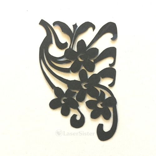
Lockdown Papercutting Project Day 45: Art Nouveau Corner Swag
“Art Nouveau Corner Swag”: Day 45 of my 2020 coronavirus Lockdown papercutting project
Read more
Lockdown Papercutting Project Day 44: Moustache Heart Filigree
“Moustache Heart Filigree: Day 44 of my 2020 coronavirus Lockdown papercutting project
Read more
Lockdown Papercutting Project Day 43: Climbing Leaves
“Climbing Leaves” papercut: Day 43 of my 2020 coronavirus Lockdown papercutting project
Read more
Lockdown Papercutting Project Day 42: Knotwork Railing
“Knotwork Railing”: Day 42 of my 2020 coronavirus lockdown papercutting challenge
Read more
Lockdown Papercutting Project Day 41: Curly Leaf
“Curly Leaf”: Day 41 of my 2020 coronavirus lockdown papercutting project
Read more
Lockdown Papercutting Project Day 40: Flower Posy
“Flower Posy”: Day 40 of 2020 coronavirus Lockdown papercutting project
Read more
Lockdown Papercutting Project Day 39: Spear Flower
“Spear FLower”: Day 39 of 2020 coronavirus Lockdown papercutting project
Read more
Lockdown Papercutting Project Day 38: Leaf Papercut
“Leaf Papercut”: Day 38 of 2020 coronavirus Lockdown papercutting project
Read more